Which of the following relationships represents a positive correlation between two variables?
As a student’s class attendance decreases, the student’s overall grade remains the same
As the number of hours a person exercises decreases, the weight of that person increases
As the number of miles driven increases, the amount of the gasoline in the tank decreases
As the amount of water plant receives increases, the growth rate of the plant increase.
Correct Answer : D
Correlation of two variables falls into:
Positive correlation: an increase in one variable causes another variable to increase
Negative correlation: an increase in one variable causes another one to decrease
No correlation: a change in one variable does not cause any response in another variable.
From the given choices
Option a is no correlation
Option b is a negative correlation
Option c is a negative correlation
Option d is a positive correlation
TEAS 7 Exam Quiz Bank
HESI A2 Exam Quiz Bank
Find More Questions 📚
Teas 7 Questions: We got the latest updated TEAS 7 questions
100% Money Refund: 100% money back guarantee if you take our full
assessment pass with 80% and fail the actual exam.
Live Tutoring: Fully customized live tutoring lessons.
Guaranteed A Grade: All students who use our services pass with 90%
guarantee.
Related Questions
Correct Answer is B
Explanation
we are asked to find the largest value from the options given. To solve this problem, we need to convert all the given values into fraction. Then find the least common denominator for all fractions, which we will use to multiply each fraction and make a comparison.
34÷96=
3/8=3/8
0.372=372/1000
37%=37/100
Now, we need to find the least common denominator of 48, 8, 1000, and 100, which is 6000. We multiply each fraction by 6000 as follows:
17/48*6000=2125
3/8*6000=2250
372/1000*6000=2232
37/100*6000=2220
From the above calculations, arranging the fraction from the largest to the smallest in order is: 3/8, 372/1000,37/100, and 17/48. Thus, the greatest value is 3/8.
Correct Answer is D
Explanation
we use given information to find how much ammonia is need to make the specified solution.
We are told, one gallon of cleaning solution requires 6 oz of ammonia. In other words, we can express this as:
1 gallon of solution6 oz of ammonia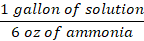
Or
6 oz of ammonia1 gallon of solution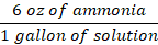
Since we are needed to find how much ammonia is needed, we use the second option to find how much ammonia is required by 120 gallons of solution.

From the above equation, gallon of solution will cancel, and oz of ammonia is left.
Therefore, the solution will require 720 oz of ammonia.
Correct Answer is B
Explanation
here we use the US customary system to convert between yards and feet. We use the conversion 1 yard =3 feet. Then, 6 yards to ft is found as
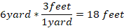
Thus, 6 yards is equal to 18 ft.
Correct Answer is D
Explanation
we need to form a mathematical expression from the given word problem.
Let the number be x.
Twice a number=2x
Five less than twice a number=2x-5
So the mathematical express from the word problem is 2x-5
Correct Answer is A
Explanation
We asked to convert kg to pounds. There are two ways of converting between kg and pounds

And

Since we are asked to find pounds, we use the second option for kg to cancel during conversion as follows:
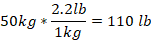
Thus, 50 kg is equal to 110 lb.
Correct Answer is D
Explanation
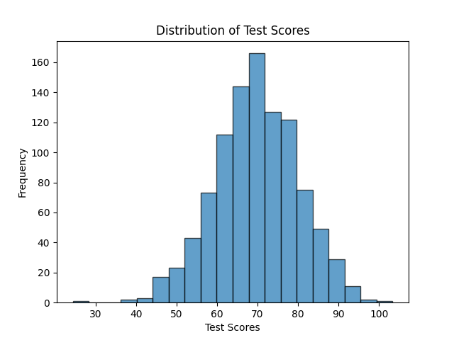
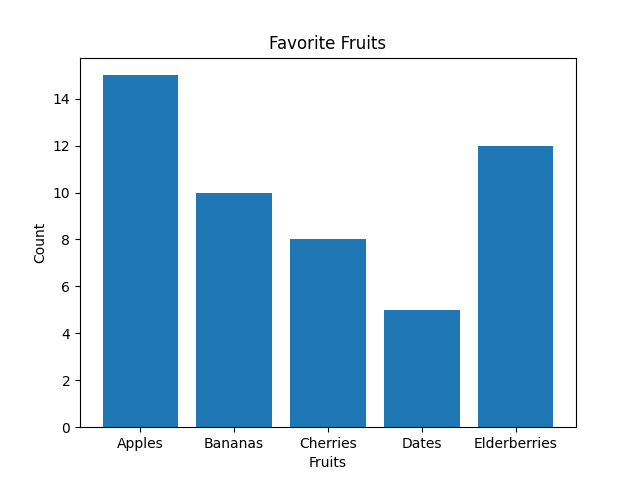
The best way to display the frequency of each day of the week when students get up after 8 a.m. is by using a bar graph. Bar graphs are well-suited for representing categorical data, where each day of the week is a separate category, and the height of each bar corresponds to the count or frequency of students waking up late on that specific day.
Note: Histograms, on the other hand, are more appropriate for visualizing continuous or numerical data and are not ideal for categorical data like days of the week.Histograms are useful for understanding the distribution of data, identifying patterns, and assessing the shape of the data distribution, such as whether it's normally distributed, skewed, or has multiple modes.
As you can see below, the Histogram is used to depict a pattern/continuous/rangedata. While a bar graph does just fine even with discrete data.
Correct Answer is B
Explanation
Since the distribution is symmetric, the mean, mode, and median will all be equal. The shape of the distribution will be bell-shaped.
Correct Answer is D
Explanation
a ratio can be converted to a fraction of the form a/b, where b is not equal to zero. In ratio form, to means per.
From the given information, the class has 15 girls and 13 boys. Thus, the ratio of girls to boys becomes:

In ratio form, girls: boys=15:13
Thus, the ratio of girls to boys in a class of 28 students is 15 to 13.
Correct Answer is A
Explanation
The initial step is to convert the decimal numbers into fractions.
4.4 becomes 44/10
4.25 becomes 425/100
Thus, the set of fractions is 9/2, 44/10, 10/3, 425/100. The least common denominator for 2, 10, 3, and 100 is 300, which we use to compare each options given.
9/2*300=1350
44/10*300=1320
10/3*300=1000
425/100*300=1275
From the above, 1350 is the greatest value which corresponds to 9/2. Thus, 9/2 is the greatest value of all the choices given.
Correct Answer is A
Explanation
To find the least common denominator (LCD) of the fractions 1/2, 2/3, and 4/5, follow these steps:
Step 1: Identify the denominators
The denominators are 2, 3, and 5.
Step 2: Find the least common multiple (LCM)
The LCM of 2, 3, and 5 is the smallest number that all three denominators divide into evenly.
- Prime factorization:
- 2=2
- 3=3
- 5=5
Since 2, 3, and 5 are all prime numbers, their LCM is:
2×3×5=30
This question was extracted from the actual TEAS Exam. Ace your TEAS exam with the actual TEAS 7 questions, Start your journey with us today
Visit Naxlex, the Most Trusted TEAS TEST Platform With Guaranteed Pass of 90%.
Money back guarantee if you use our service and fail the actual exam. Option of personalised live tutor on your area of weakness.