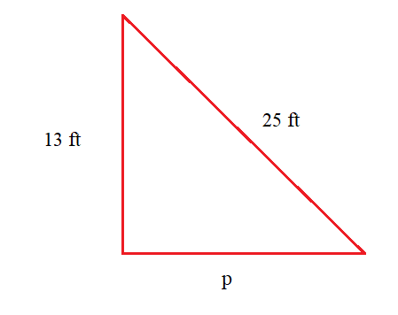
A math teacher obtained the following scores from a class of 45 students. Which of the following is the best way to display the frequency of each day of the week?
|
Test score |
50-59 |
60-69 |
70-79 |
80-89 |
90-99 |
|
Number of students |
10 |
4 |
9 |
20 |
2 |
Scatterplot
Pie graph
Line graph
Histogram
Correct Answer : D
In order for the teacher to better visualize the test performance for his class, he needs to present the mark distribution in chart form. A better chart visualizer is the histogram, which will show the frequency of marks against range of test scores. A bar graph will not be used because the rectangles need to touch one another.
In a bar graph, the rectangles do not touch each other. Therefore, it will not be a good chart visualizer.
TEAS 7 Exam Quiz Bank
HESI A2 Exam Quiz Bank
Find More Questions 📚
Teas 7 Questions: We got the latest updated TEAS 7 questions
100% Money Refund: 100% money back guarantee if you take our full
assessment pass with 80% and fail the actual exam.
Live Tutoring: Fully customized live tutoring lessons.
Guaranteed A Grade: All students who use our services pass with 90%
guarantee.
Related Questions
Correct Answer is A
Explanation
The truck carries a whole cargo which equals 1. If we let the weight of the cargo to be p, then we set up a proportion equation with weight as numerator and fraction of cargo as denominator.

Solve for value of p by cross products

Multiply both sides by 3/2 a reciprocal of 2/3
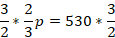

The truck carries a cargo weighing 795 lb.
Correct Answer is C
Explanation
To convert 514 to a percentage:
Step 1: Convert the mixed number to a decimal
514=5+14=5+0.25=5.255
Step 2: Convert to a percentage
Multiply by 100:
5.25×100=525%
Correct Answer is D
Explanation
From the cost of 45 syringes, we are required to find the cost of 5 syringes. We set up a proportion equation by letting the cost of 5 syringes to y. Besides, we let the cost to be numerator and number of syringes to be denominator as follows.

Solve the value of y by cross products
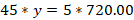
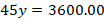
Divide both sides by 45
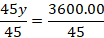

Therefore, 5 syringes will cost $80.00.
Correct Answer is D
Explanation
Based rainfall falling for the first 5 months, a bar graph will give a great display for the farmer to decide when start planting. The horizontal scale will represent months of the year and vertical scale will present the amount of rainfall falling.
Correct Answer is D
Explanation
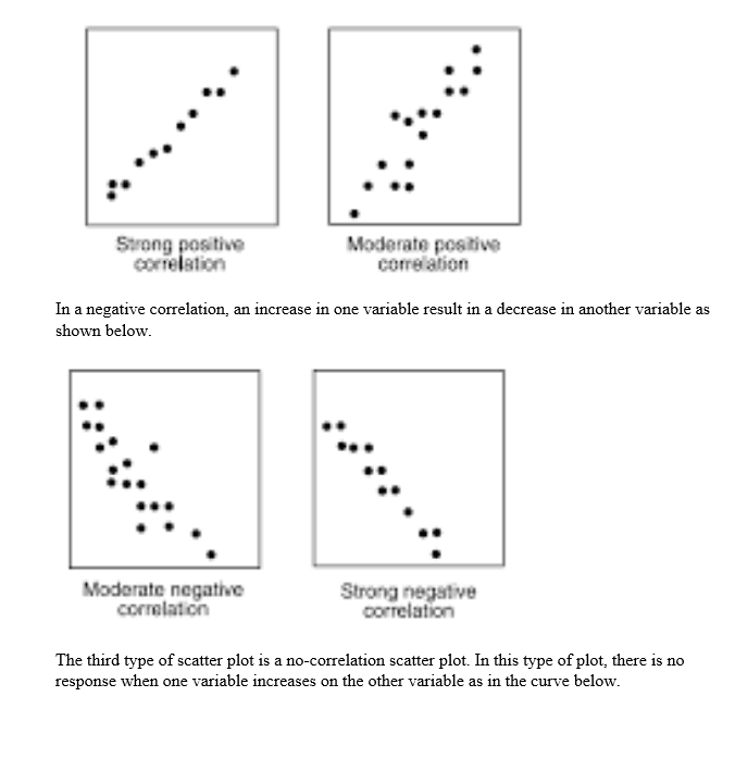
Scatter plots can depict three correlations: positive, negative and no correlation. A positive correlation scatter plot reveals that as one variable increases, the other variable also increases as shown below
Correct Answer is C
Explanation
In this problem, we need to find the amount of gratuity the couple will leave. The gratuity is 16% of the total bill. Before solving the problem, the following are terms and their meaning in percent problems:
- Is means equals
- Of means multiply
- What means unknown (variable)
If we let x be the amount of gratuity, then translating the given problem into a mathematical equation becomes:
Now we evaluate the above equation noting that of means multiply.
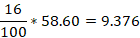
So, the value of x=9.376 and to the nearest cent, x=9.38
There, a couple will leave a gratuity of $9.38.
Correct Answer is B
Explanation
In this scenario, we use the given scale in the charts to find the number of each coin and selected the right number of coins the student collected.
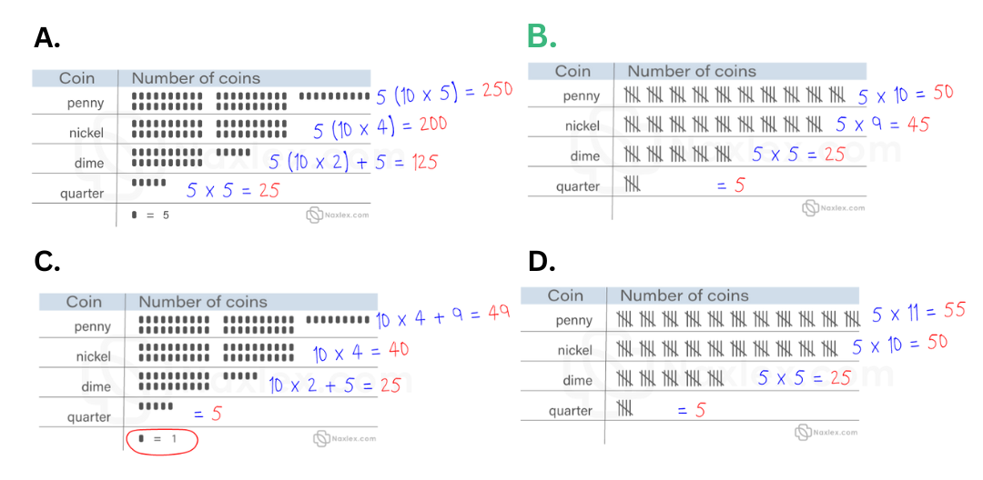
From the above evaluations, option two is the correct choice.
Correct Answer is D
Explanation
We are required to find the percent equivalent of the given fraction.
We multiply 7/8 by 100 to convert it to percent. You convert fraction to percent.

Thus 7/8 is equal to 87.5%.
Correct Answer is C
Explanation
From the given data, we can draw the following triangle by letting the unknown length to be p.
We apply the Pythagoras theorem, the value of p:
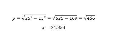
The unknown length of the triangle is about 21.4 feet.
Correct Answer is A
Explanation
The first five months of the year are January, February, March, April, and May. We use to graph to find the amount of rainfall in each month as follows:
In the month of January, rainfall was between o and 1, which is halfway. Therefore, rainfall in January is 0.5 inches
On February, rainfall was 1 inch and on March the rainfall was 2 inches.
On April, the rainfall amount was 4 inches while on month of May, the rainfall was about 3.5 inches. Therefore, total rainfall in the first 5 months was:
Total rainfall=0.5 inches+1 inches+ 2 inches+4 inches + 3.5 inches =11 inches
This question was extracted from the actual TEAS Exam. Ace your TEAS exam with the actual TEAS 7 questions, Start your journey with us today
Visit Naxlex, the Most Trusted TEAS TEST Platform With Guaranteed Pass of 90%.
Money back guarantee if you use our service and fail the actual exam. Option of personalised live tutor on your area of weakness.