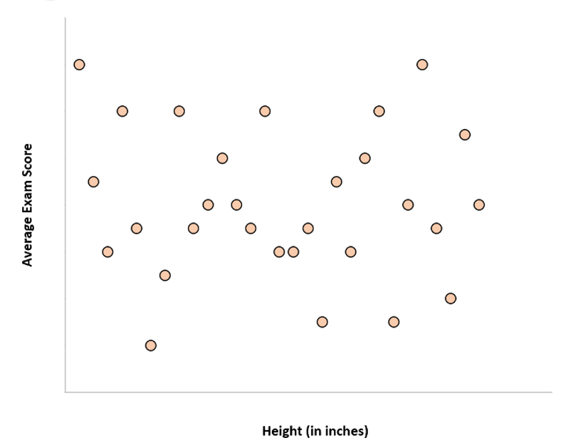
The scatter plot below shows the relationship between the student’s exam scores and the students’ heights. Which of the following types of correlation is shown on the scatter plot?
Positive
Positive and negative
Negative
No correlation
Correct Answer : D
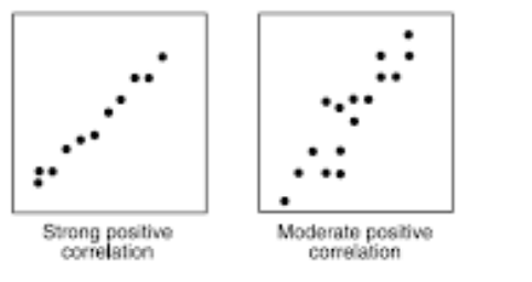
correlations fall into positive, negative, and no correlation. A positive correlation shows that an increase in one variable increase results in an increase on the other variable increases as shown.
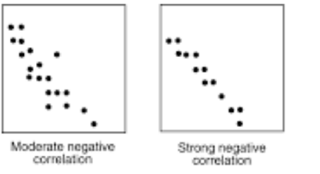
A negative correlation scatter plot shows that an increase in one variable results in a decrease on the other one.
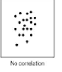
The no-correlation scatter plot demonstrates that there is no response between variables. A change in one variable has no effect on the other variable.
Looking at the provided scatter plot, the heights of the students does not have any relationship on the students’ scores. Thus, the type of correlation is no correlation.
TEAS 7 Exam Quiz Bank
HESI A2 Exam Quiz Bank
Find More Questions 📚
Teas 7 Questions: We got the latest updated TEAS 7 questions
100% Money Refund: 100% money back guarantee if you take our full
assessment pass with 80% and fail the actual exam.
Live Tutoring: Fully customized live tutoring lessons.
Guaranteed A Grade: All students who use our services pass with 90%
guarantee.
Related Questions
Correct Answer is D
Explanation
: the question requires we find the cost of four syringes.
If we let x be the cost of four syringes, then we set up a proportion equation with cost as numerator and number of syringes as denominator. The proportion equation becomes

Cross-multiply to solve for x
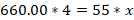

Rearranging the above

Divide both sides of the equation by 55


Thus, the cost of 4 syringes is $48.
Correct Answer is C
Explanation
In this problem, we need to find the amount of gratuity the couple will leave. The gratuity is 16% of the total bill. Before solving the problem, the following are terms and their meaning in percent problems:
- Is means equals
- Of means multiply
- What means unknown (variable)
If we let x be the amount of gratuity, then translating the given problem into a mathematical equation becomes:

So, the value of x=9.376 and to the nearest cent, x=9.38
There, a couple will leave a gratuity of $9.38.
Correct Answer is C
Explanation
The distribution of the weights of the newborn babies is symmetric meaning the mean, mode, and median are all equal. Thus, the bell-shape curve describes this kind of distribution of weights
Correct Answer is D
Explanation
We need to find the radius in order to find the area of the pizza.
Radius of pizza
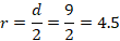
The area of the pizza

But r=4.5
Thus, the area of the pizza is 20.25  in2.
in2.
NOTE:  is used as is since values of pi may vary e.g. 3.14, 3.142, 22/7. Hence we use pi symbol to generalize.
Correct Answer is A
Explanation
The length of the unknown side of the rectangle can be found by using the Pythagoras theorem. Letting the unknown side to be x, the labelled rectangle becomes: The unknown length of the triangle is about 16.7 feet.
The length of the unknown side of the rectangle can be found by using the Pythagoras theorem. Letting the unknown side to be x, the labelled rectangle becomes: 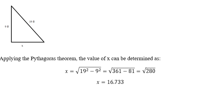
The unknown length of the triangle is about 16.7 feet.
Correct Answer is D
Explanation
The babies' measured weights change over time and depend on the time interval after birth. Since weight is the outcome being measured, it is the dependent variable in the study.
Correct Answer is A
Explanation
We convert the given word problem into a mathematical expression.
Let the number be x.
Thrice a number = 3x
Twelve less than thrice a number = 3x-12
Thus, the required mathematical expression is 3x-12
Correct Answer is C
Explanation
The best way to visualize the student’s score for each subject is to plot them using a bar graph.
Correct Answer is D
Explanation
correlations fall into positive, negative, and no correlation. A positive correlation shows that an increase in one variable increase results in an increase on the other variable increases as shown.
A negative correlation scatter plot shows that an increase in one variable results in a decrease on the other one.
The no-correlation scatter plot demonstrates that there is no response between variables. A change in one variable has no effect on the other variable.
Looking at the provided scatter plot, the heights of the students does not have any relationship on the students’ scores. Thus, the type of correlation is no correlation.
Correct Answer is A
Explanation
In this scenario, we use the given chart and scale provided to find the number of each coin and select the right number of coins the student collected.
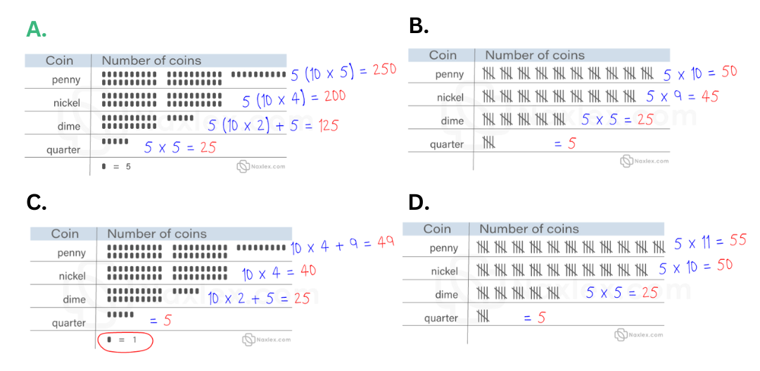
It is clear that the first choice if the correct answer. The child collected 250 pennies, 200 nickels, 125 dimes, and 25 quarters.
This question was extracted from the actual TEAS Exam. Ace your TEAS exam with the actual TEAS 7 questions, Start your journey with us today
Visit Naxlex, the Most Trusted TEAS TEST Platform With Guaranteed Pass of 90%.
Money back guarantee if you use our service and fail the actual exam. Option of personalised live tutor on your area of weakness.